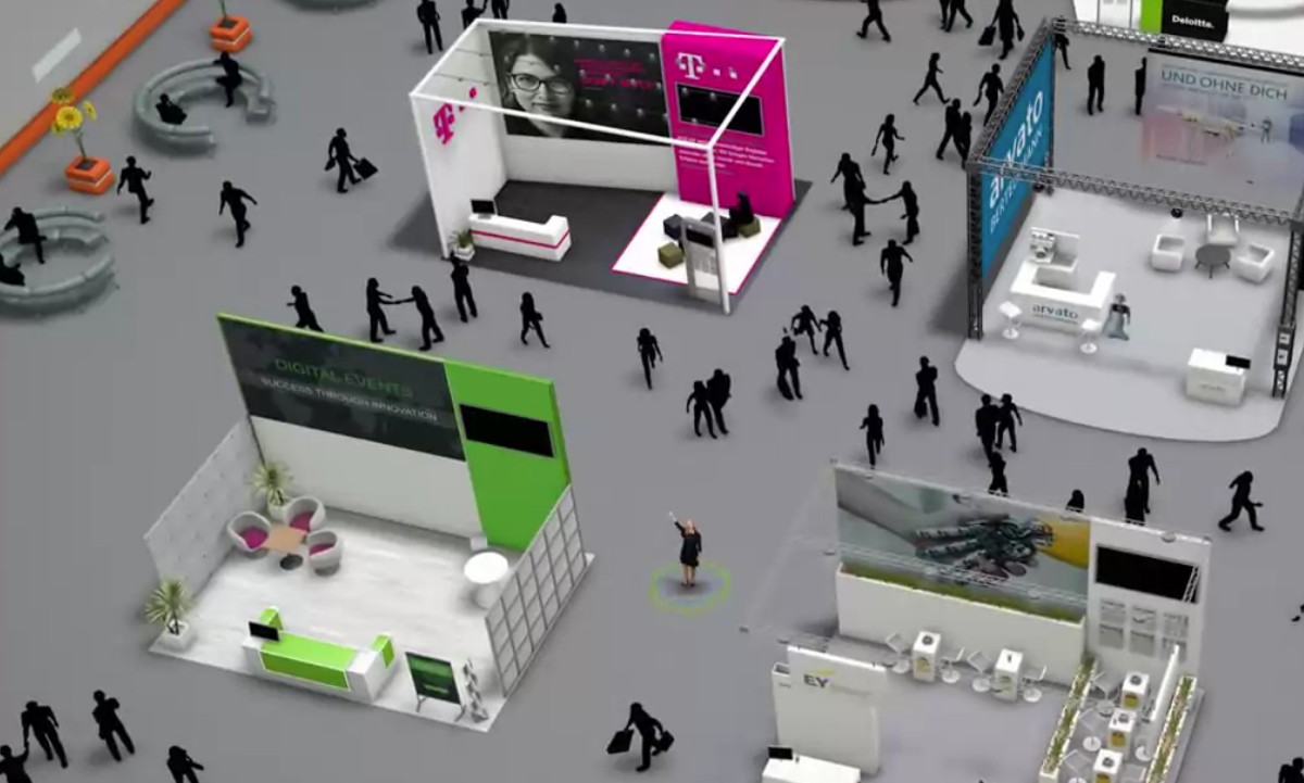
The COVID-19 pandemic has forced the traditional trade show industry to pause, leaving businesses without one of the most lucrative marketing solutions, but, in the meantime, virtual booths have become fantastic alternatives. As events are moving online (and capturing mass appeal while doing so!), brands are switching to this hybrid solution to keep audiences engaged while at the same time optimizing already reduced budgets. On their own, virtual booths can achieve much more than classic online promotional tools because they combine great visuals with interactive features. However, the number of businesses that use them is increasing exponentially, which means that audience interest is no longer a given. With so many options to compare, users will start looking closely at the details and choose only those brands that have used technology in the most creative way for their virtual booths.
Here are 4 things you should keep in mind when designing a virtual trade show booth to impress your audience and stand out from competitors.
The booth design should be consistent with your overall branding strategy
Knowing your audience is the first and most important step before designing any kind of promotional material. Apart from details such as age, location, job position, and interests, don’t forget to consider previous brand interactions when brainstorming ideas for your booth. Part of the audience who will visit your booth may not have stepped foot into a traditional trade show before, but many of them may have interacted with your brand in a trade show. This is why, for continuity and consistency, your booth shouldn’t go too far from your existing layout and design.
Even though they are online, virtual booths rely on the same visual cues and people who have been at a trade show before expect that familiar feeling. They want to see elements such as an entry lobby, a podium, digital screens, or a customer support desk. So, what you’ll have to do is translate that experience in digital format as much as possible. That doesn’t mean you can’t add more things, however. On the contrary, since they don’t have the limitations of physical trade shows, virtual booths can benefit from countless creative possibilities. Just make sure you keep everything consistent with your overall branding strategy and use the same color scheme, company logo, and other relevant visuals.
Communication is vital
Would you picture a trade show booth without a brand representative to walk you through their products and services and answer your questions? Of course not. Communication is the bread and butter of trade shows, and that applies to their digital equivalent.
Every virtual booth should have a designed area for brand interaction, and you can represent it as a reception or dedicated support desk. From there, make sure you include as many communication options as possible to cover all visitor preferences. For example, some visitors may want to reach out to you via email, while others prefer using a live chat.
Educate your audience
People come to trade shows to get the pulse of the industry, look for new suppliers and investigate partnership options. They also come to trade shows to learn new things, which is why it’s always a good idea to include virtual booth elements that educate audiences. There are several ways to do that. At the most basic level, you can include links to PDF documents, whitepapers, or industry reports, which appeal to the more knowledgeable visitors. Then, you can include explanatory videos or 3D tours to give insights into how your products work. But the ultimate educational elements are webinars, which not only offer audiences valuable information, but also take engagement to the next level.
-
Less is more
As amazing as virtual trade shows may be, it’s important to know when to stop adding new elements. Just like in the case of physical trade shows, virtual booths can become too overwhelming and confusing if there are too many stimuli, so make sure you don’t go overboard. If you use playable media, make sure you ask for the visitors’ confirmation first, so that they don’t distract them from exploring the booth. Also, all elements should have a logical sequence to them and feel intuitive even to beginners.
