Whether you’re looking to generate highly convertible leads for your business through mail marketing or you want to clearly inform your potential clients about your products/services whilst compelling them to do business with you at the same time, brochures provide the platform. But other than considering who and how they read your brochure and what action you want them to take, designing a result-obsessed brochure takes a whole lot more. That is exactly why I have taken the pain to show you how to make an e-brochure, whether bi-fold or tri-fold brochure design, for your campaign success with 4 useful tips.
Tip 1; Define The What
First thing first. Be clear about the focus-goal of your outreach. This will ensure that your design and the message in it are aligned to work in tandem for maximum conversion. Another reason to define your outreach goal is that it helps you to make the right choice between a physical brochure and an e-brochure.
For instance, if you were to drive traffic to those flash sales on your new store, an electric brochure that features a promo code for first-time visitors is ideal. Conversely, suppose you want people to attend your webinar or your booth at an upcoming trade, then both a physical and an e-brochure should be designed on both of which you can showcase your newest product and even include coupon codes for the same product on the electronic version.
Tip 2; Clear Message
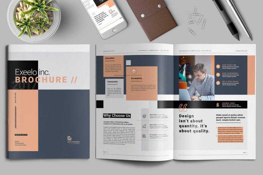
It’s not about what you say but what your audience hears. So to speak, it is essential to not only make your message concise but skimmable as well from start to finish. Starting from the front page, it must be eye-grabby with relevant visuals and should summarize your outreach in fewer words whilst providing enough space to promote special deals or special products. And remember, your brand’s logo must always be well-positioned on the front page.
In the body, write your copy into, at most, three sections. Each section should not be more than 50 words and the typography must not only be bold and clear but also represent your brand. One more good rule of thumb is to support your headers with brief descriptions and your statistics with graphs, charts, or other data visuals. For the back page, however, you can be as creative as you want but make sure that a brief about your business together with all your contact information should be included.
Tip 3; Uniqueness
After creating your message, collect unique images and illustrations that are relevant to your campaign and as well represent your brand in a fashion. Also, keep the style and color of your images consistent whilst leaving enough space layout for readability on every page.
Tip 4; Repurpose
Finally, you have your brochure ready. But shuffling the cards around won’t hurt. Right? Edit the same brochure and try to make multiple versions of the same so you can have options to choose from. Who knows the last edition can turn out to be the best one?