
While strolling along the streets of Facebook, Jane came across an exciting ad offering a once-in-a-lifetime car deal. She hopped on the ad, and it took her to a landing page where the offer was embedded.
But the site owner had made a school-boy error – adding a menu bar on the landing page. Out of curiosity, Jane clicked on the menu bar to see if there were other enticing deals she could find on the site.
As expected, she saw another fantastic offer and decided to go with that.
This is a typical example of a landing page that’s failed to convert. Yes, Jane did buy something. But not what the business wanted.
I bet you have similar landing pages that aren’t converting clicks into customers. In this post, I’m going to show you how to boost your landing page conversions.
How to boost landing page conversions
- Keep your landing page distraction-free
A landing page will fail to convert if it has too much distracting content luring or pushing customers away.
The marketing team needs to define what the goal of the page is and build the landing page accordingly. And that goal needs to be shared across the team—it’s one of the basics of business communication that companies often overlook.
In the case above, distraction came via the added menu bar. This was likely because the design team and the marketing team weren’t communicating properly. In other cases, a distraction could be caused by the following:
- Added an unnecessary footer note
- Used an ambiguous or hard to find CTA
- Used distracting visual elements such as stock photos
- Cluttered the interface with too much content
- Incorporated unsolicited pop ups into the landing page
- Used a high-contrast color on a less-important CTA or section
See an example of this:
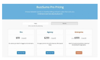
I’m willing to bet that BuzzSumo’s most desired action is the Enterprise plan. By using an orange color on the $999 plan, they’ve drawn users towards a high revenue-generator. When I saw this landing page, my eyes went straight to the orange-text CTA.
If you eliminate distractions from your landing pages, you’ll significantly boost focus and conversion. To identify and eliminate distracting elements on your landing pages, ask yourself this simple question: If I was a customer, what might distract me from this page?
To improve the internal landing page creation process, design a flowchart for the marketing and design teams to follow.
- Write simple, bold, catchy headlines
When creating landing pages, it’s essential to use captivating headlines. Why? Because you have only a few seconds to grab readers’ attention. The best way to do that is by throwing something simple, bold, and attention-grabbing in their faces.
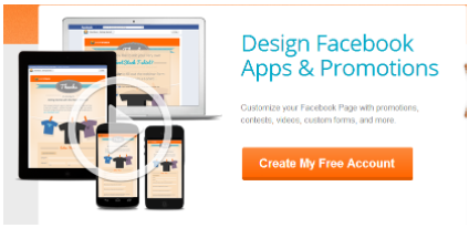
See an example of a landing page with a good, catchy headline:

Anybody looking to sell stuff on the internet will surely be captivated by this headline. No cap!
See another one I like:

Imagine that you’re having difficulty creating good headlines for your landing pages, and you stumble on this one. You’ll be immediately drawn to the headline.
- Use compelling CTAs
CTAs are the most important element in landing page optimization. If you want your landing pages to work magic on incoming traffic, then you need to use CTAs that are not only attention-grabbing but also compelling.
That is, they must make people want to take action.
To create effective CTAs in your landing pages, you need to consider three critical aspects.
The color: Ensure the CTA button contrasts in color to the background. Based on research and experience, I can tell you that GREEN, ORANGE, and BLUE work best.
See an example:
The size: How big or how small your CTA button is can determine conversions to a great extent. You want to use a CTA button that’s not so small that users struggle to see it. You also have to make sure it doesn’t look too big and weird. The best size is one that syncs perfectly with the page layout.
The message: This is where the real work lies. You have to ensure that your choice of words instills a sense of need and urgency for the product/service.
- Make sure the page loads fast
When users come across a link to a product or service offer, they expect to click through and land on the relevant page in no time at all.
Nobody expects a landing page to take forever to load. Forever, in this case, is anything from 3 seconds upwards.
Remember, it is a landing page. Therefore, it shouldn’t have too much content or too many images slowing the site down.
A slow-loading landing page will reduce conversion, as many users may opt against continuing with the process at all.
- Optimize your form fields
Once a user clicks through a landing page, the next thing they expect to see is a page allowing their desired action – purchase, enroll, join, contact, inquire, etc.
They don’t expect a form to fill. But we both know that’s not how this works. Form fields are crucial for building email lists, which means you have to add them.
However, this isn’t a big problem. Just make sure your forms are so simple that users can fill it in less than 5 – 10 seconds.
To do that, you have to ensure you don’t ask too many questions or request too much information.
If you go anywhere above 10 seconds, the user might lose patience and exit your page. If I were you, I’d even stick to asking for nothing but the email address.
- Add testimonials and reviews
Adding testimonials and reviews to landing pages is now a huge trend in the industry. In my experience, it boosts conversion greatly.
Many studies have also found that landing pages with testimonials tend to do better than those without them.
So, to increase your landing page conversion, I suggest you add believable testimonials.
By believable, I mean testimonials that users can trust. Not some fake-looking comments like:
“Great work!” – Maddie B.
“Wow!” – James S.
“I’ve made so much money since I joined!” – Elijah M.
Who is Maddie B.? And who the heck is Elijah M.?
See a good example of a believable landing page testimonial:
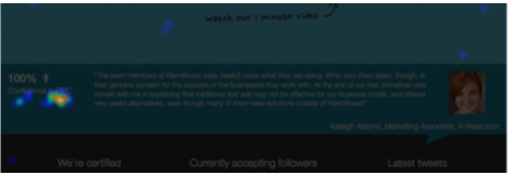
You can add similar ones in the footer section of your landing pages, or try something like this:
- A/B test your landing pages
When it comes to landing page optimization, there’s really no one-size-fits-all answer. However, you can determine what works best for your audience by testing different landing page layouts and content.
Using a dedicated A/B testing tool, you can segregate your audience into various groups and then target each group with a different landing page structure. Afterward, analyze the results of each group to see which structure works best for your audience.
Here are some of the best A/B testing tools for landing page optimization:
- Crazy Egg
- AB Tasty
- SiteSpect
- Omniconvert
- Unbounce
- VWO
- Apptimize
- Google Optimize
Conclusion
That’s that about boosting your landing page conversion. It’s fairly easy and definitely achievable. Stick to the tips we’ve discussed, and you should start seeing better results in no time.